When we think about communication, most of us think first of words. But for a truly cohesive, immersive communications program, organizations should also consider how they go beyond the written word, using their whole creative toolbox. Visual elements play an important role in capturing attention, conveying messages and creating a memorable brand identity or campaign.
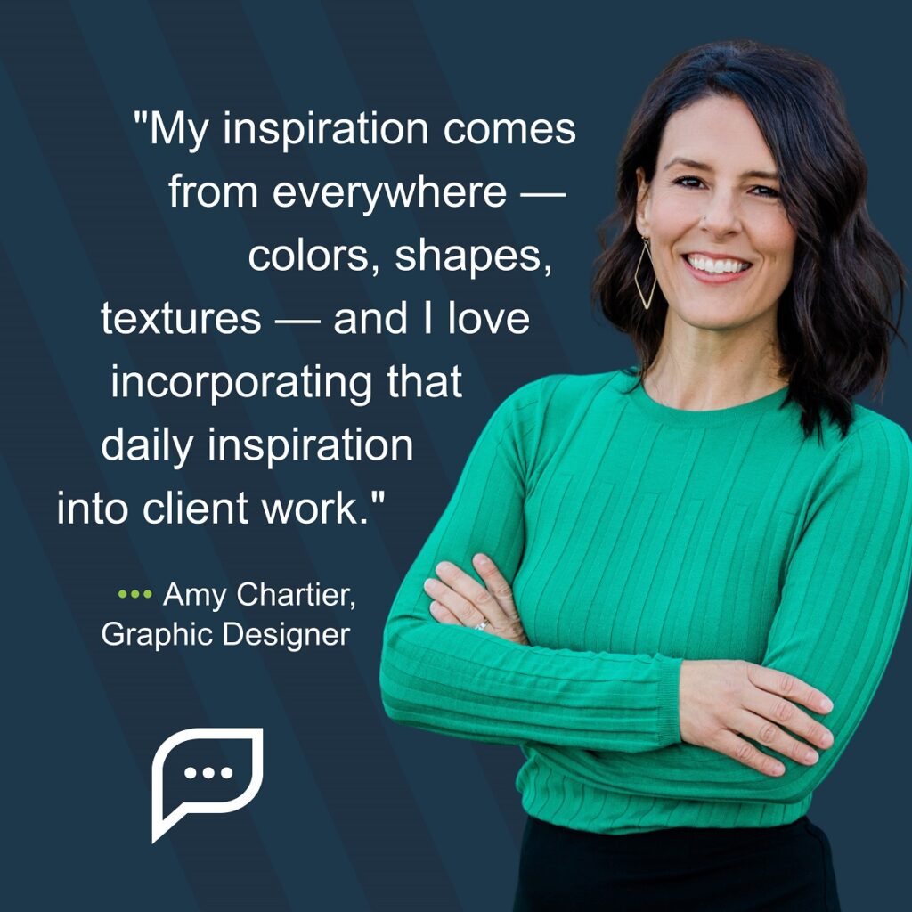
Our Spring Green team includes top-notch designer Amy Chartier, a strategic partner who helps us create smart, targeted, visually appealing work for our clients. I recently sat down with Amy to ask a few questions about how she develops design experiences that help our messages stick.
Q: Why does design matter?
A: Design matters because people have a very small window of time to become engaged. Customers can be pulled in — or pushed away — within a matter of seconds, and they often base their decisions on visual appearance. A viewer will make a judgment of a business’ competency, quality, service and value based on that first impression. If your message and design are not clear, concise and visually appealing, it will likely result in a negative first impression and your customer will feel less confident and secure about what you are offering.
Q: How should organizations think about creative design and graphics in a way that supports their larger brand strategy?
A: Clear messaging is always at the forefront of a strong brand strategy. If a company doesn’t have a clear vision of what they are offering, how they want to grow and who their audience is, the brand’s creative execution and audience engagement will naturally suffer. Designers usually look to “The 5 As” of branding — Awareness, Authority, Authenticity, Appearance and Audience. These are crucial elements to keep at the forefront of any brand strategy, and it’s important to make sure these elements come through in the design. When developing a creative strategy, ask yourself: Do these words, colors and images come together in a way that feels authentic for this brand?
Q: What are some design trends you’re seeing?
A: “Modern nostalgia” — a blend of styles from the past and the present — hit the design world in 2022. It’s a great trend that I hope will stick around — it’s fun, relatable and creates a sense of trust by playing to that nostalgic familiarity.
An aesthetic called Risograph also looks to be making a comeback. Think vintage aesthetics mixed with a modern flair. You might also know Risograph printing as a technique similar to the more familiar digital screen-printing process, in which the outcome is layered, with vivid color and imperfect texture, but with the convenience of more modern technology. This is a more tactile type of medium, but I would guess we’ll also see this recreated in the digital sector as well.

Source: Creative Market – artist @Bornx Design
Q: How can an organization with an in-person workforce use their physical environment to help immerse employees in company culture?
A: Creating community and connection is important. With an in-person workforce, employees often spend more time with their colleagues than they do with their own families and friends. This makes fostering a sense of community through belonging and purpose within a workforce crucial. A fun and engaging atmosphere that allows opportunities for teambuilding, continued learning, and recognition can create a sense of connection and trust that is necessary for loyalty and success within any organization.
It’s also important to be visually inspired and excited. Think about what your employees are experiencing every day. Are they looking at grey walls in a dark office space? If so, make sure they have ample time to take breaks and get outside to refuel. Find ways to rejuvenate their senses with color, light, interesting textures and natural elements. I love this quote from Recognize.com: “In the workplace, inspiration is a crucial component of a productive team. When workers are inspired, they are energized and motivated to perform at their highest level.”
Additionally, incorporate messaging and branding elements that remind your employees of their purpose. How is this business adding value to its customers? How are your employees a part of helping people, solving a problem or creating solutions for others? There is a lot of motivation in the “why” we do what we do. Take opportunities to remind your workforce that what they are doing is important and that they are truly making a difference through the work they accomplish every day.
Q: What should organizations think about when they look to create a brand culture around design experience?
A: Companies should always start by creating a brand guide. This is their source of truth, and they will come back to it time and time again. Establish a clear visual identity that your organization adheres to, including colors, typography, logo usage and a more general style guide. Be sure to align these design principles with your messaging and ask your creative team to adhere to these guidelines to support the organization’s broader communication and marketing goals. Visual elements should consistently reinforce the key messages and values of your brand.
If you are interested in learning more about how Amy and the rest of the team can help you develop your organizational style, check out our blog or reach out to us directly — we would love a chance to tell you about our experience.
by Emily Pappas
